Brand Identity Design
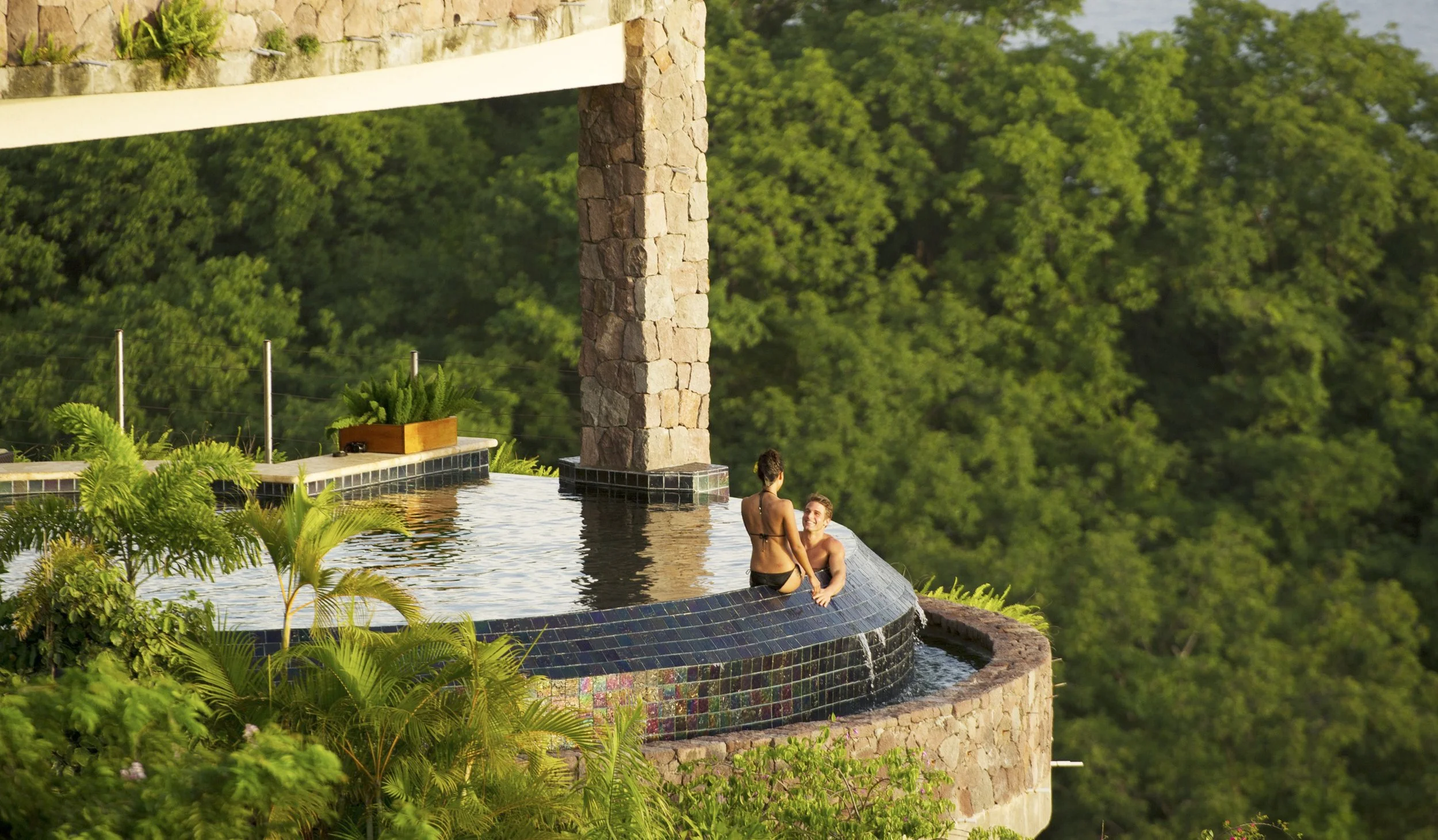
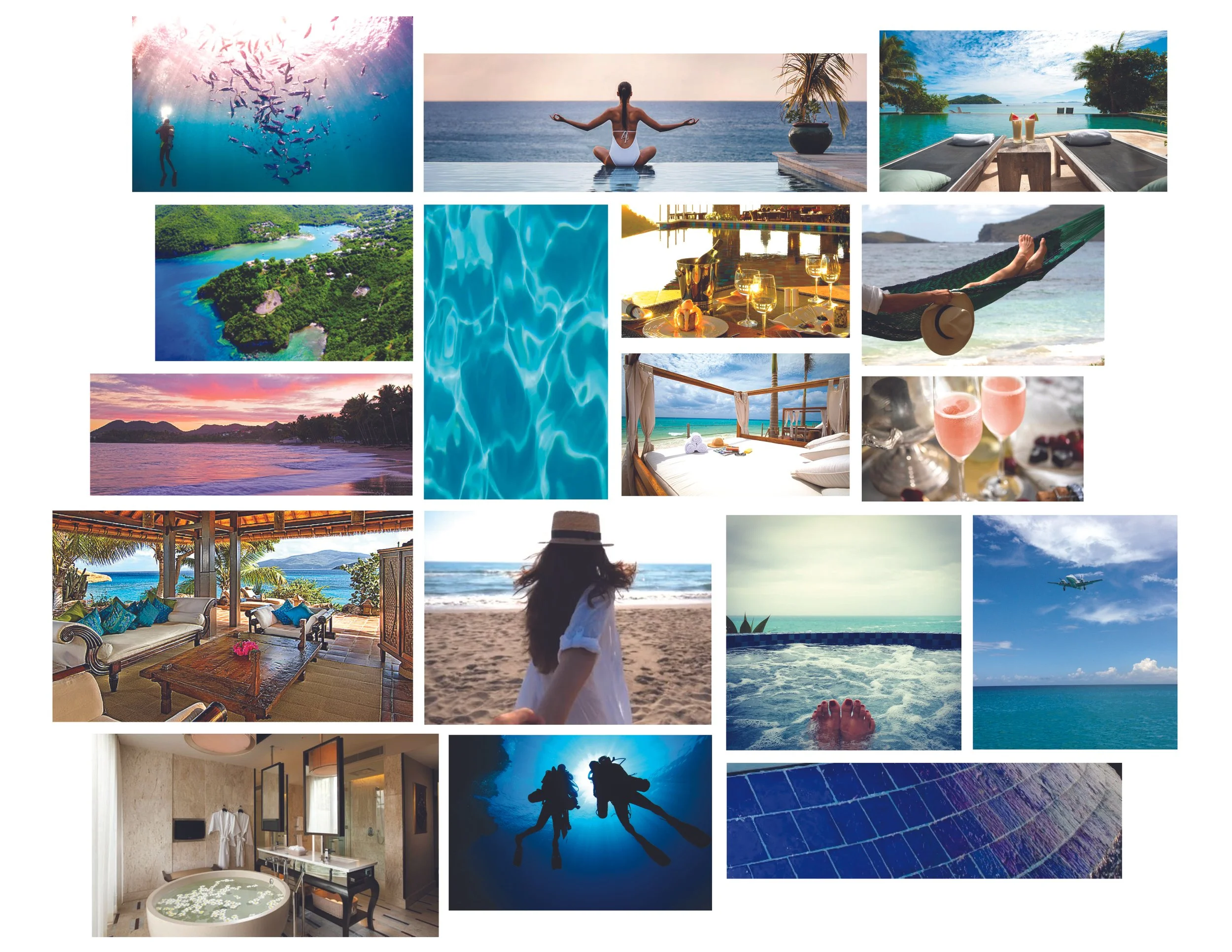
The objective of redesigning the Jade Mountain brand is to elevate the branded appearance to match the amazing architecture of the resort. Such a unique luxury resort should be portrayed as such. The new design will be vibrant and elegant with a real sense of opulence. It should feel inviting and relaxing, yet exclusive. The design should reflect the resort's architectural design that blends with it’s natural surroundings.

The Resort
Jade Mountain opened December 2006. Built by owner/Architect Nick Troubetzkoy--a Russian-Canadian Architect from the West Coast of British Columbia.
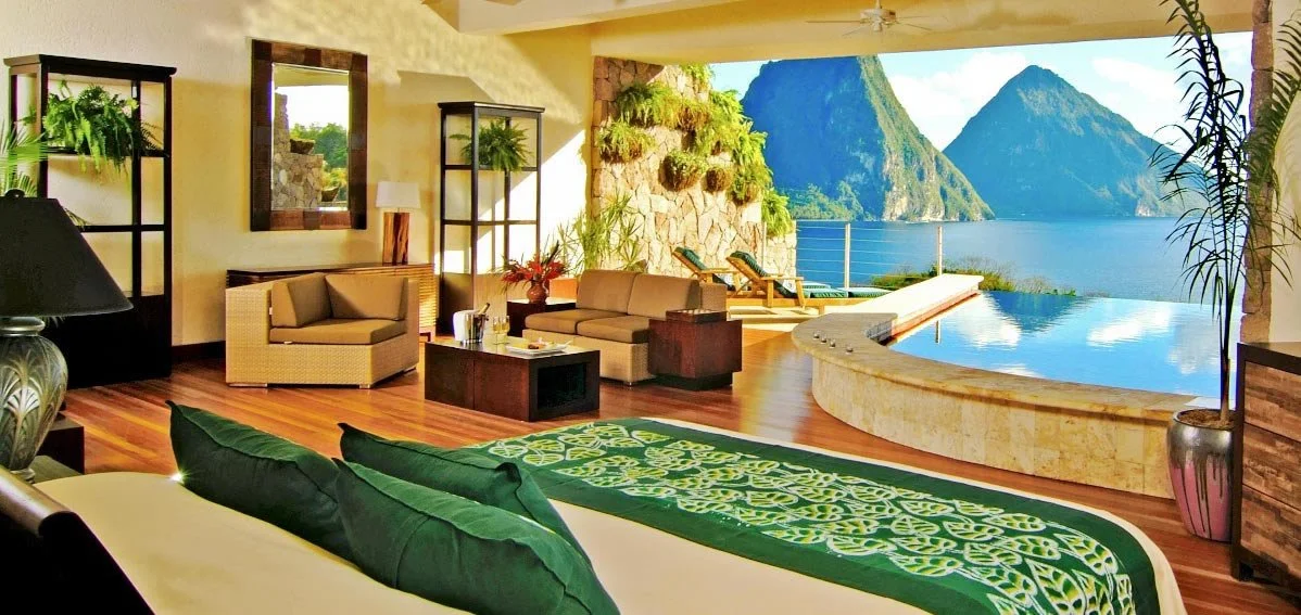
Troubetzkoy was determined to revolutionize conventional thinking as to what a hotel room should look like and to dispel the traditional practice of having each room a cookie cutter duplicate of the next.
The design of Jade Mountain reinforces the connection to the natural environment with passive ventilation of the rooms and natural day-lighting. Heating and cooling of the sanctuaries (rooms) is based entirely on the natural rhythms and cycles of the world around us. Not being dependent on artificial cooling or lighting of the rooms decreases the use of precious energy resources and minimizes the carbon footprint of the resort.
Troubetzkoy’s love for large open spaces built in harmony with nature was first realized in his redesign of Anse Chastanet and then reached a new level of sophistication in his creation of Jade Mountain.
Art Direction & Design
Creation of a Visual Language To Match the Stunning Open-Air Resort
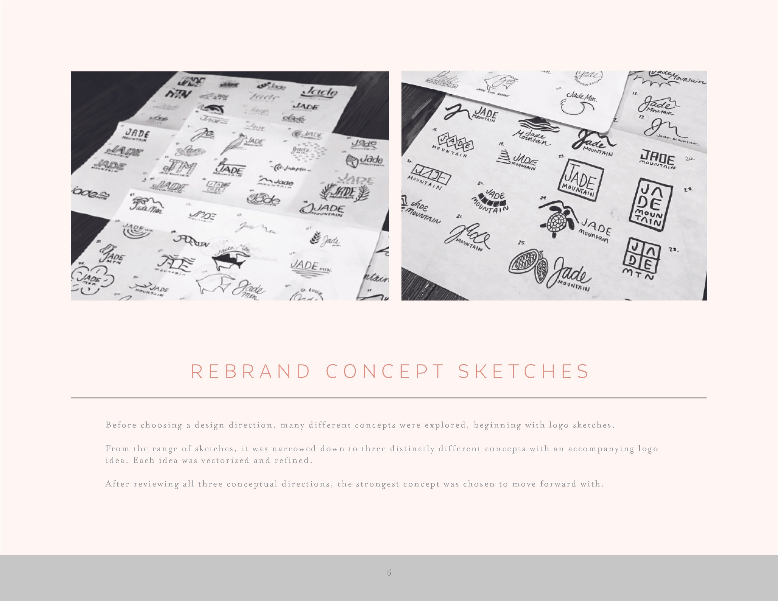
Initial Concepting
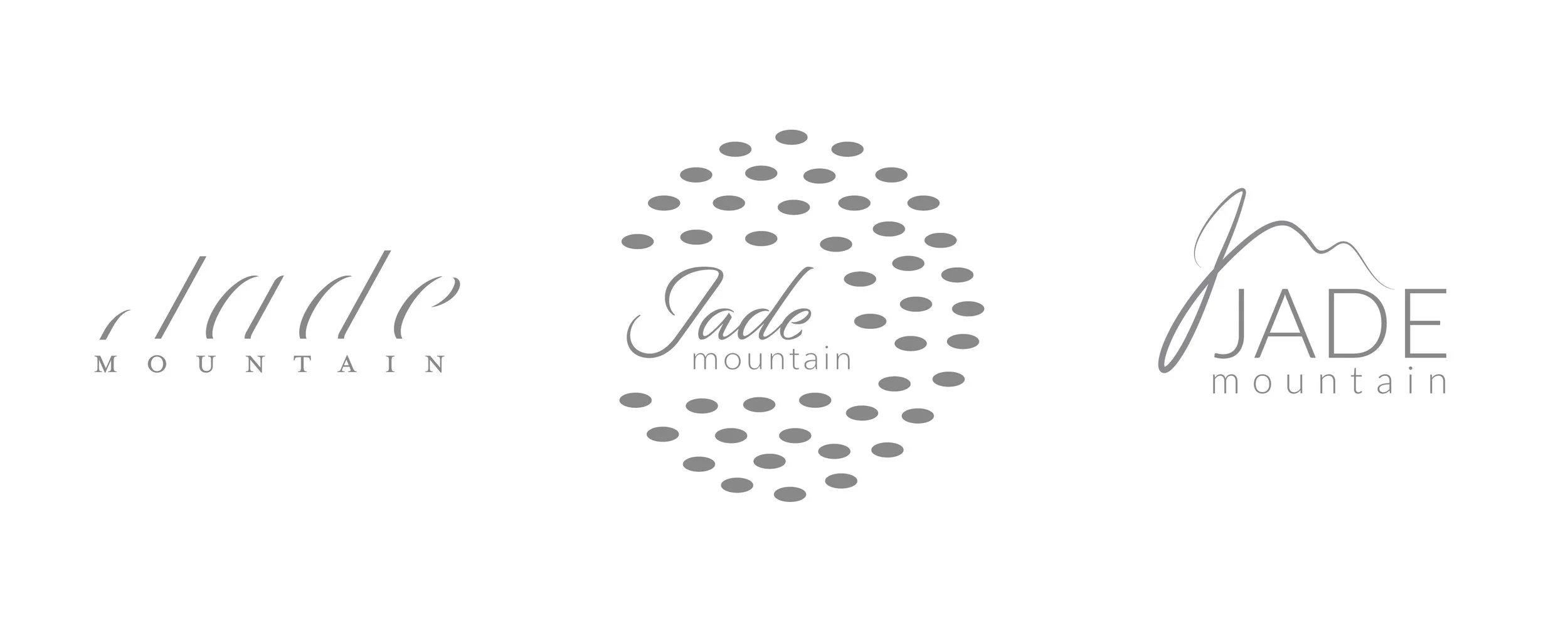
Before choosing a design direction, many different concepts were explored, beginning with logo sketches. From the range of sketches, it was narrowed down to three distinctly different concepts with an accompanying logo idea. Each idea was vectored and refined. After reviewing all three conceptual directions, the strongest concept was chosen to move forward with.
Digitized Concepts
Sketches were reviewed and analyzed. Three were chosen based on how they addressed the Rebrand Objective and overall aesthetic appeal. These sketches were carried out into vector and presented to the client.
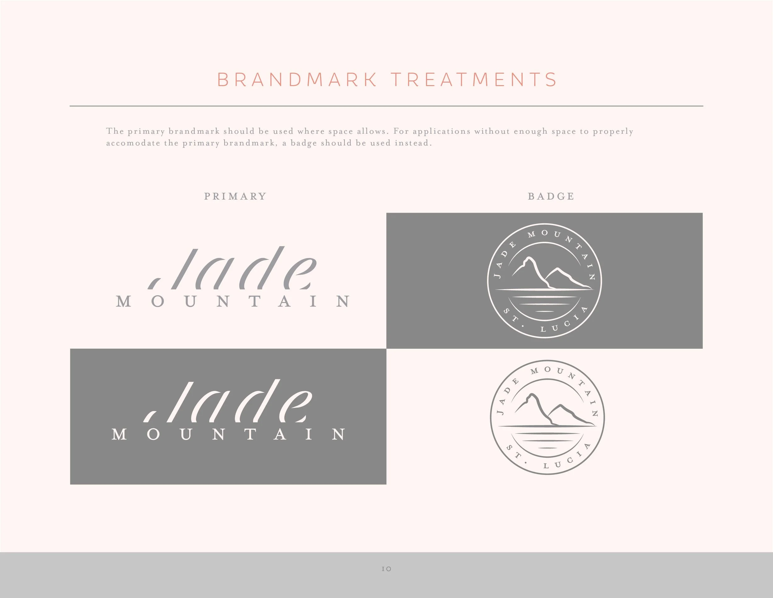
Primary Mark
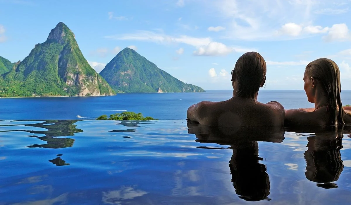
Using designs that mimic the beautifully elegant horizons that surround the resort highlights the quality that makes Jade Mountain so special-a view from every room. A key design element throughout the resort centers around the architecture flawlessly fading into the horizon.
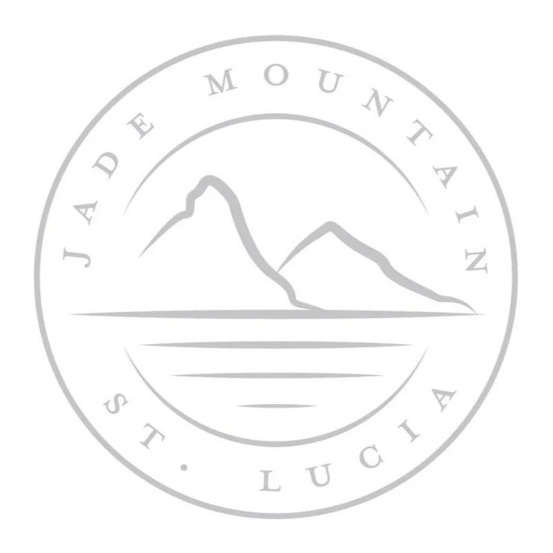
Secondary Mark
The secondary mark would be used in place of the logo where space is limited. Playing off of the same idea of horizon lines seen in the original brand mark, the curved type conserves space and preserves legibility at a small scale. The badge shape works where the primary mark does not.
Brand Elements
Colors were chosen to blend naturally with the architecture and environment. Neutral grays and and off-white sand tones reflect the resort’s calm, relaxing, and refined atmosphere while complementing photography. The coral accent is representative St. Lucia’s popularity amongst the scuba diving community and was chosen to stand out when paired with the otherwise neutral palette.
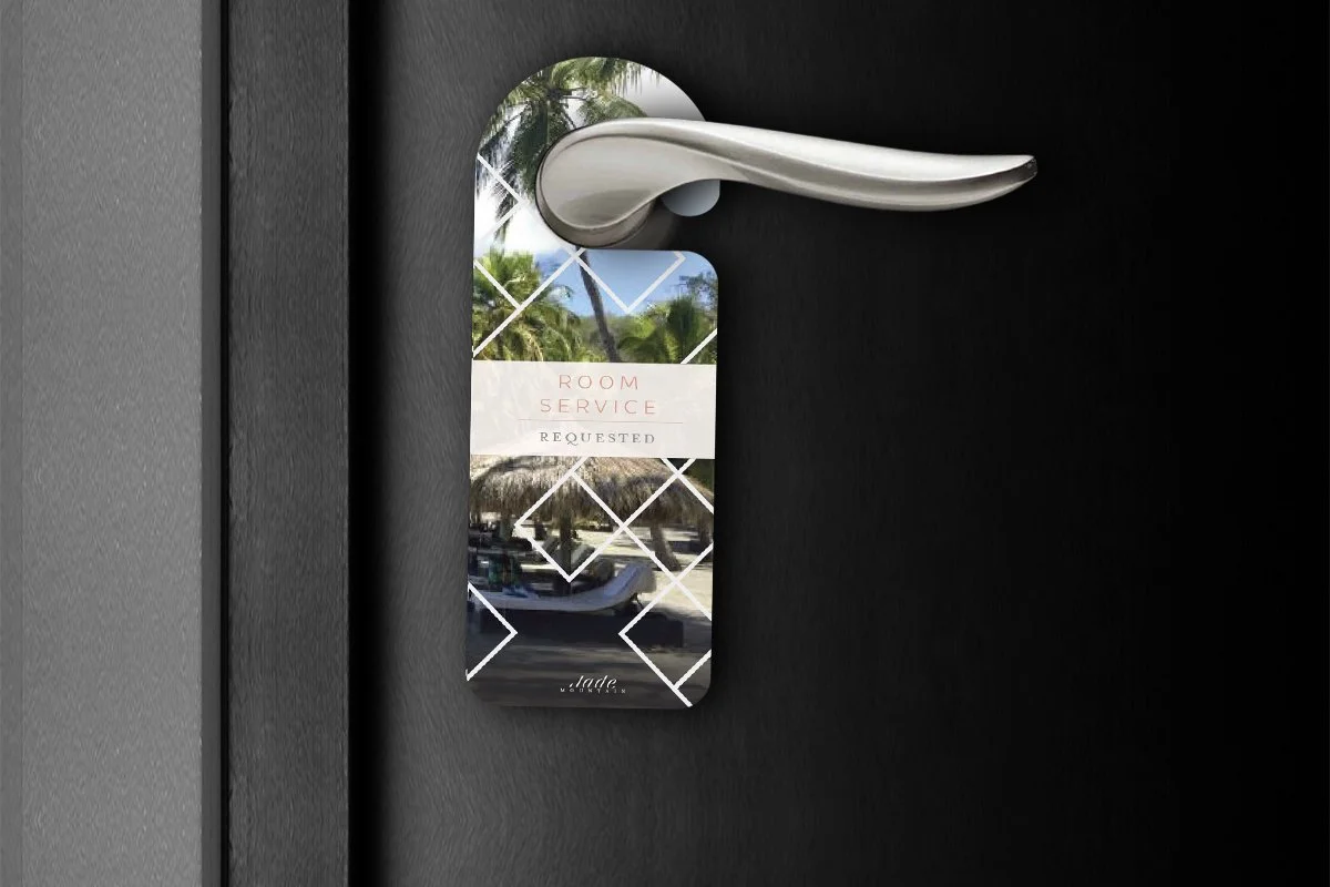
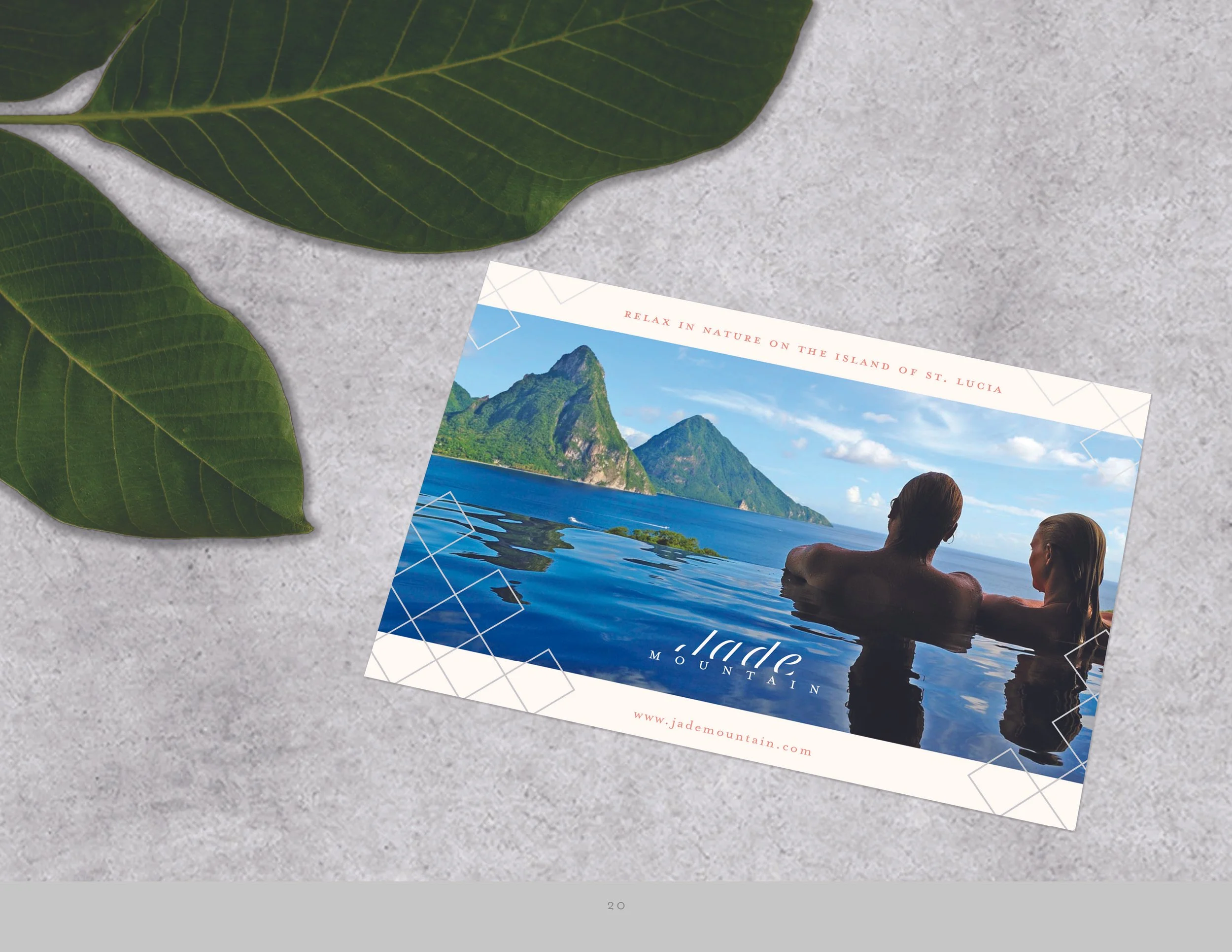
Tiled squares are featured as a design element throughout as an homage to the vibrant, hand-crafted tiles famously used throughout the resort’s architecture. This tiled design also mimics the arial view of the signature open-air rooms. Placed on top of photography, the tiles are a way to brand an image without altering the color or quality. In smaller applications, the tiles can be used as a holding shape.
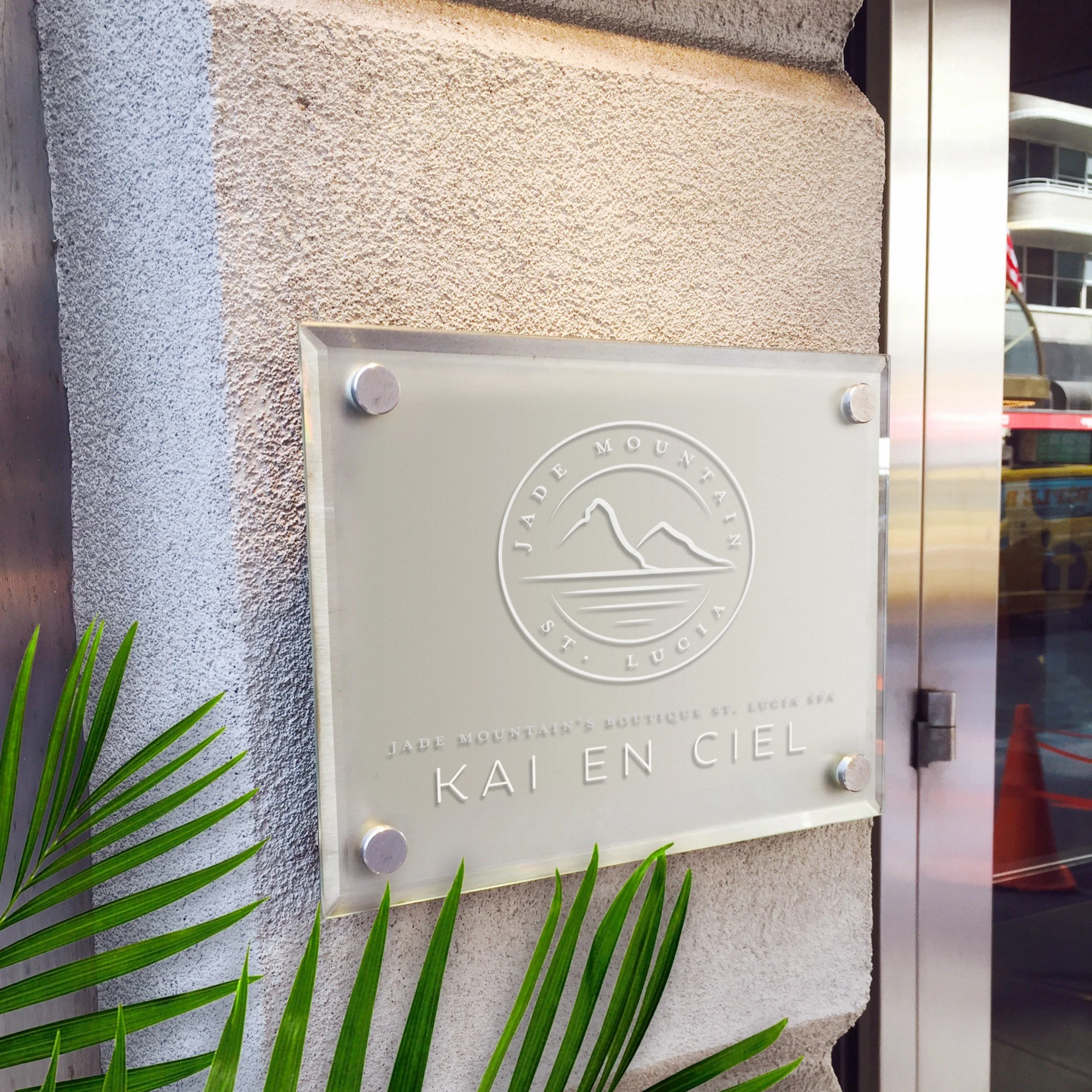
The primary logo should be used when possible. Featured on lobby signage, trademark robes in the spa and guest suites, and other signage around the resort.
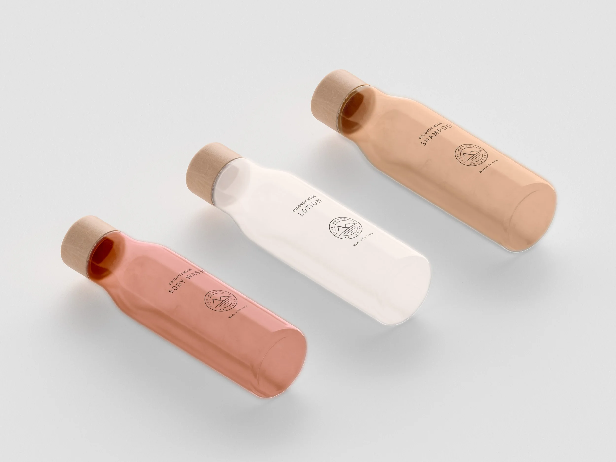
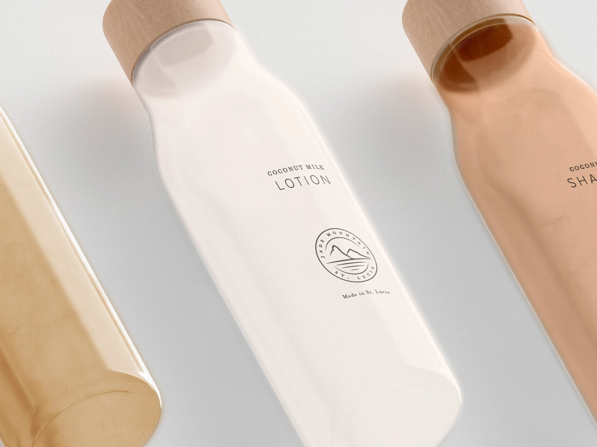
Hotel Touchpoints
Marketing Materials
Brand Book

